Fegurd.
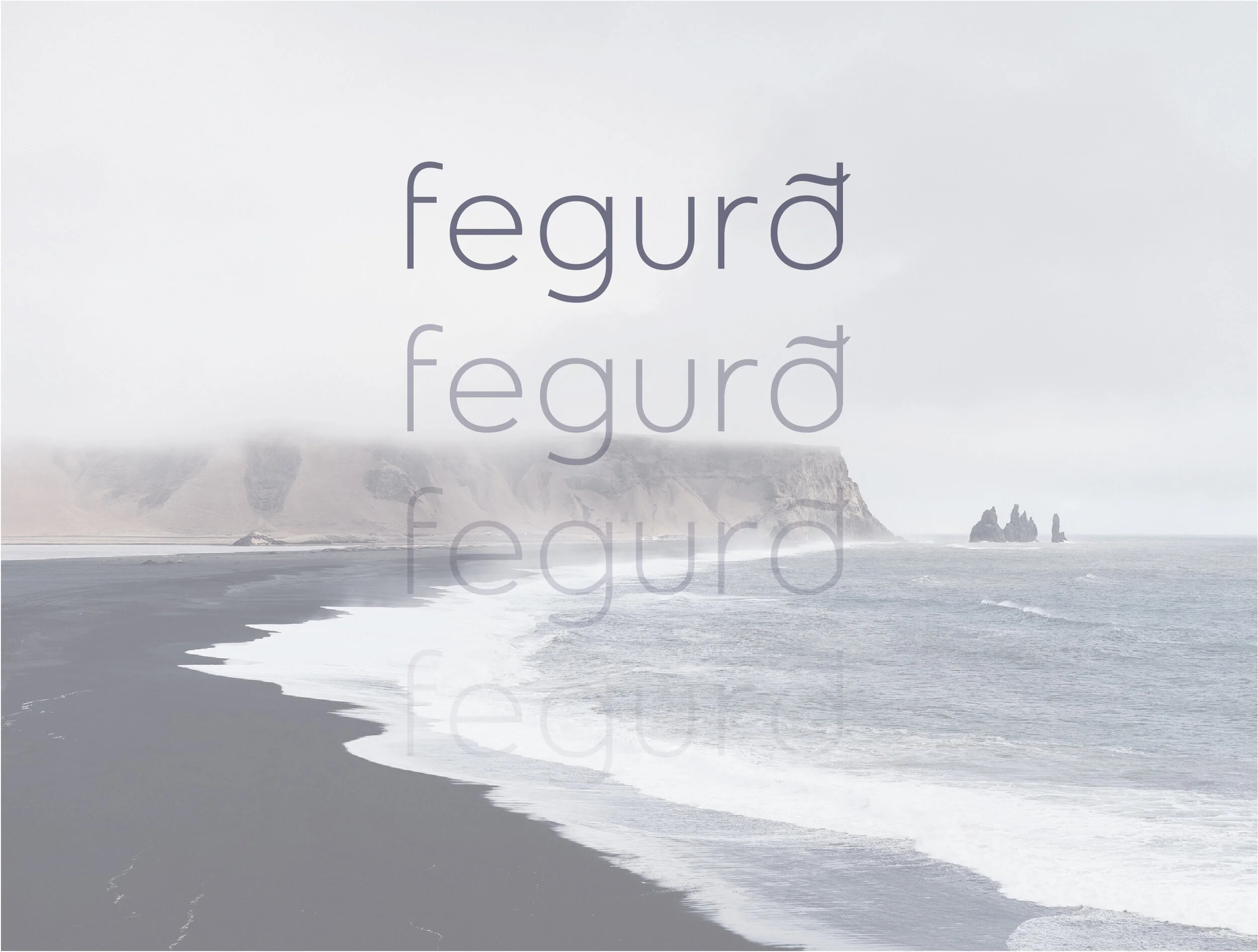
Conceptual packaging design for a range of innovative, Nordic influenced formulations. Taking inspiration from healing and relaxing properties in the product ingredients and embracing the sense of self healing the Nordic landscape offers, the name ‘Fegurd’ means simply ‘to heal’. A ‘swoosh’ in the logo mimics the natural contours that the waves make when hitting the Nordic shoreline.
The name itself is linguistic and stays true to the root of the concept. It is also simple and encourages the consumer to slow down and ‘heal’ from the day’s activities and stresses. The final concepts are spa inspired and take inspiration from the natural beauty of the land.
Bespoke Logo.

Mood Board.

Design Route 1.

Design Route 2.