
Brand Refresh | Social Suite | Presentation Deck | Newsletter
CEASE
Overview
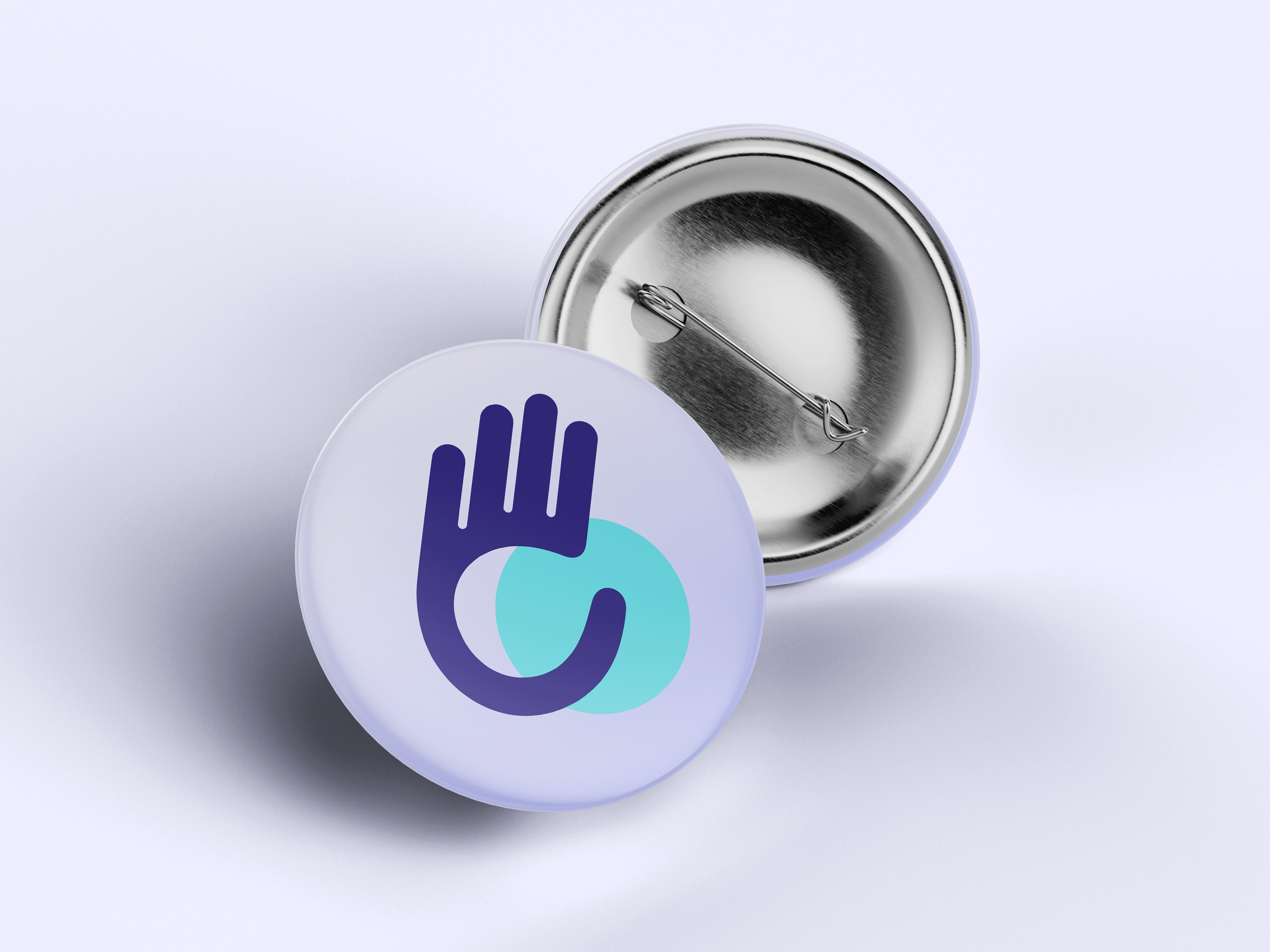
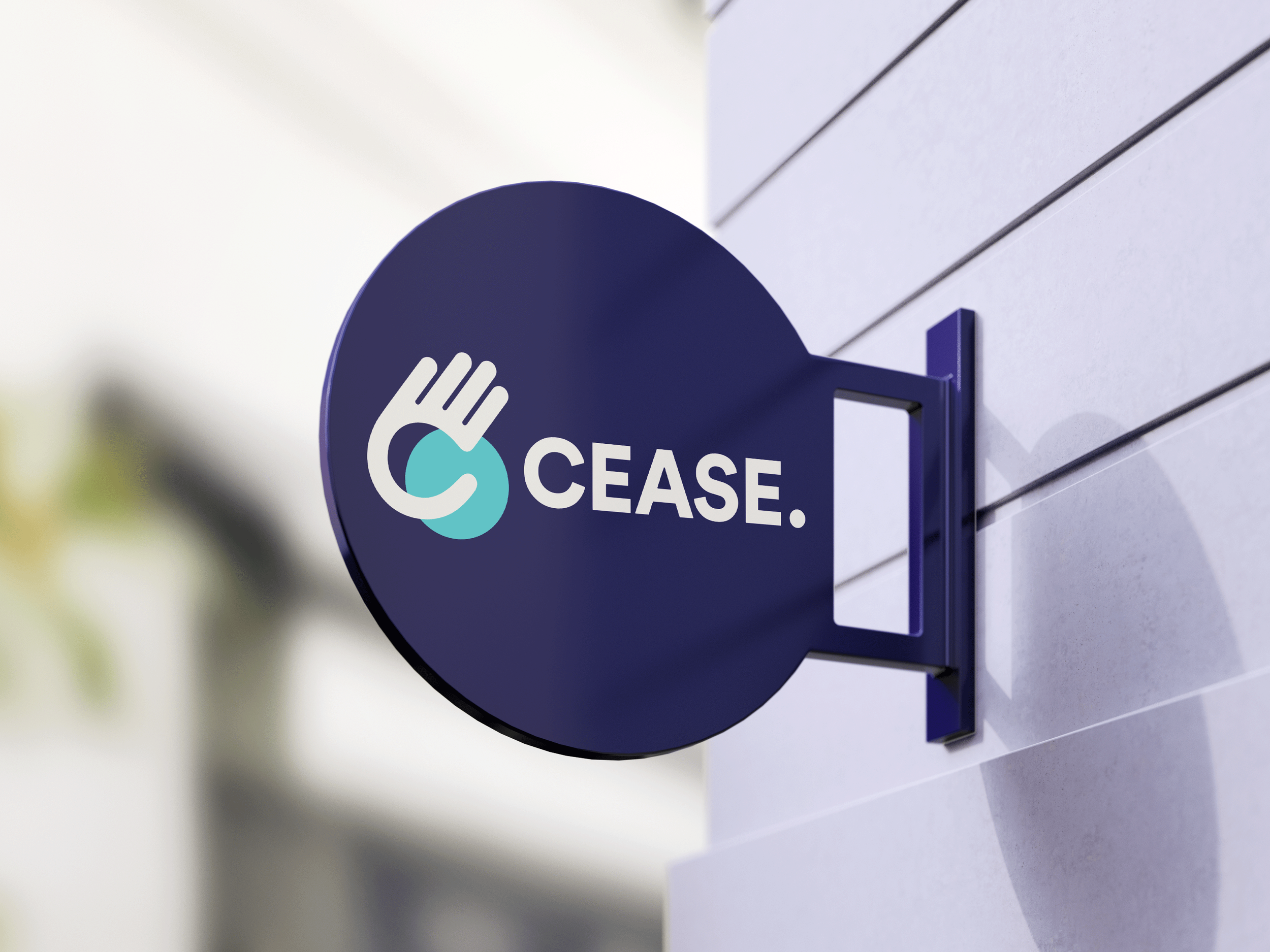
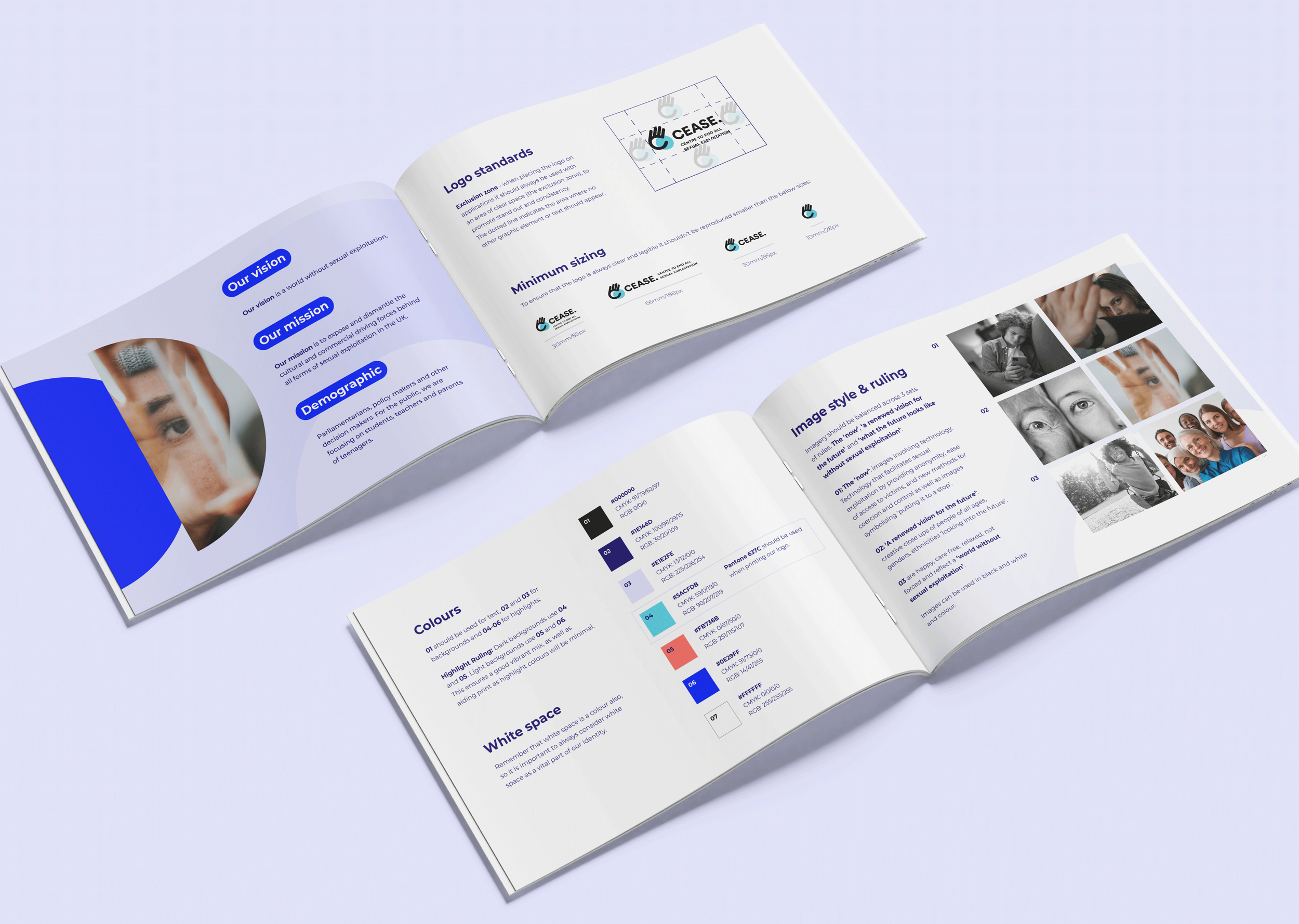
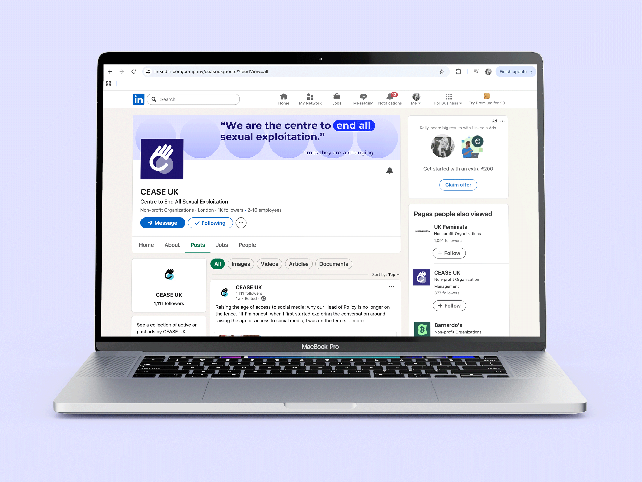
CEASE is a UK charity working to end sexual exploitation through research, advocacy and public policy. The project focused on refreshing the existing logo and identity, creating a stronger, more distinctive visual presence while retaining the recognition and trust they had already established. Rather than reinventing the brand, the existing logo and identity were evolved to create a more confident and flexible visual system while maintaining familiarity with existing audiences. The creative concept, "To a Full Stop," became the foundation of the identity, using visual symbolism to reinforce CEASE's mission of bringing sexual exploitation to an end. The project included a refined logo, expanded brand toolkit and a suite of marketing assets to support consistent communication across digital and print.
Challenge
The challenge was to evolve the brand without losing familiarity. As a respected organisation tackling a sensitive subject, the identity needed to balance authority with approachability while communicating hope and progress.
The creative strategy centred on the concept "To a Full Stop" – an expression meaning to bring something to an end completely. This universal idea became a visual metaphor for CEASE's mission to end sexual exploitation. The full stop itself informed the use of circular graphic devices throughout the identity, creating a distinctive and recognisable visual language that could be applied consistently across the brand.
The concept also acknowledges that ending sexual exploitation is not an instant achievement, but a gradual process driven by awareness, education and systemic change. This journey is reflected through the use of colour gradients, symbolising movement from solid to transparent – representing progress towards a future where exploitation no longer exists. Every design decision, from typography and colour palette to graphic elements and imagery, was carefully considered to create a cohesive identity that is both meaningful and adaptable across campaigns, reports, presentations and fundraising materials.
Outcome
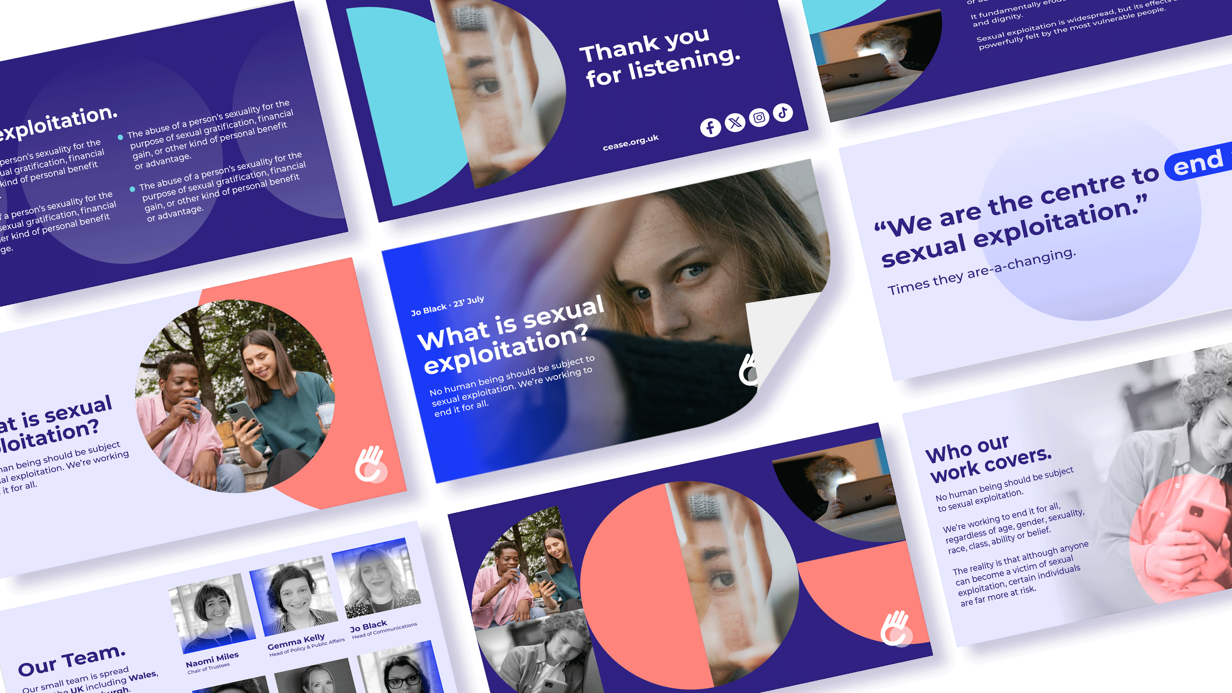
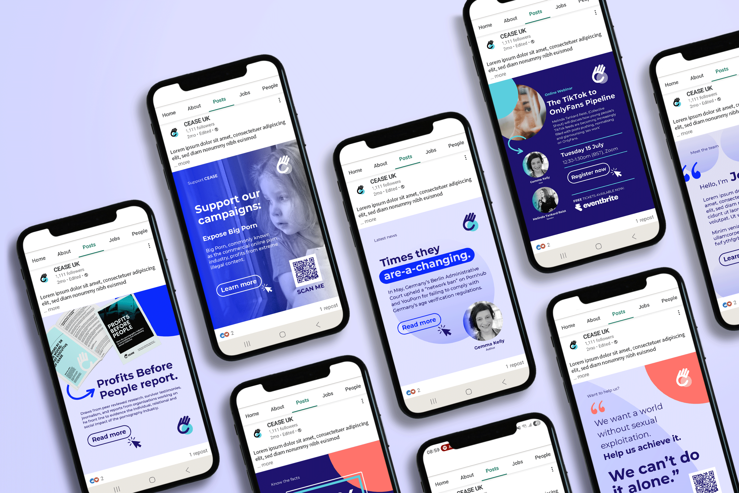
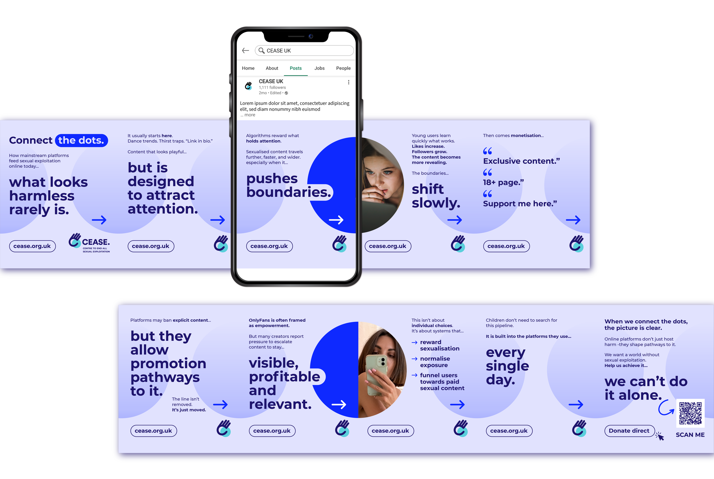
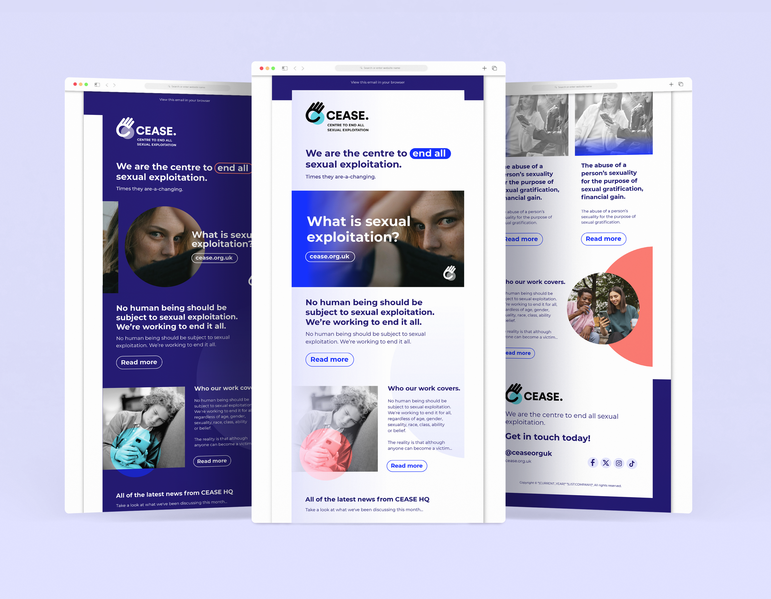
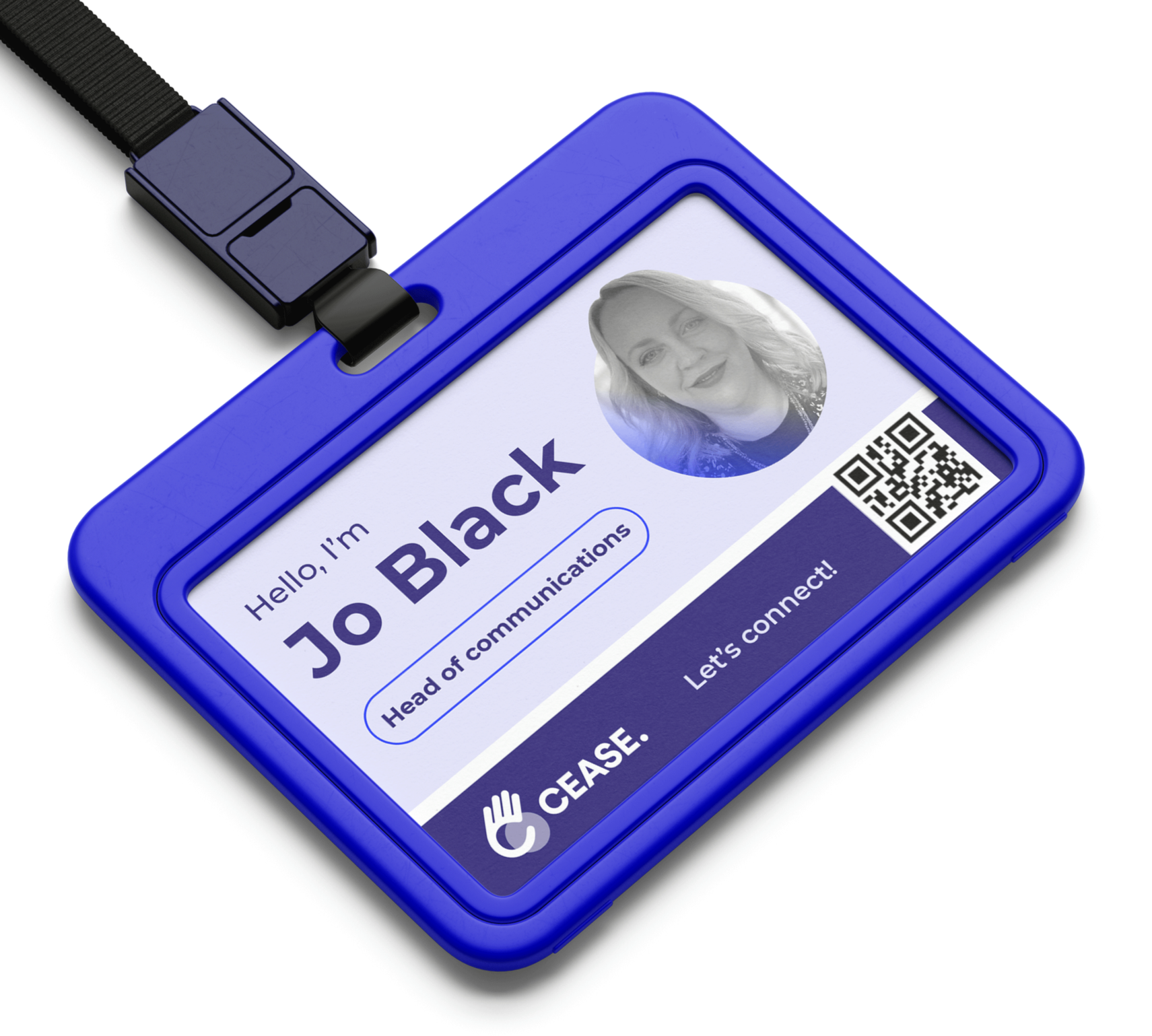
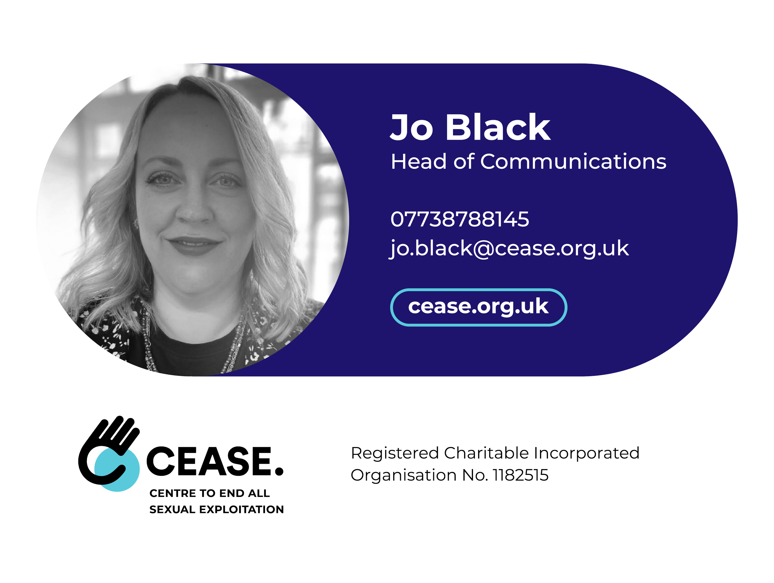
The result was a refreshed, future-ready brand that provides CEASE with a flexible visual identity across every touchpoint. Alongside the updated logo and comprehensive brand guidelines, the project included presentation templates, social media assets, email signatures and newsletter templates, ensuring the organisation could communicate consistently and professionally across all channels. The new identity is bold, recognisable and purpose-driven, translating the "To a Full Stop" concept into a visual system that reflects both the seriousness of CEASE's work and its ambition to create lasting, meaningful change.

Working with the new brand has been a real turning point for us. It feels bold, purposeful and genuinely reflects who we are, giving us a visual identity that matches both the importance of our work and the future we're striving to create.”
Naomi Miles, CEO

Passionate about authentic, bespoke design that adds real value.
Not every business is going to have the same needs, so it is vital that we understand your vision for the future and create a bespoke solution, that is individual to you and the growth of your business. That’s why all of our services are specifically tailored to your individual requirements.
We believe great design goes beyond aesthetics - it should communicate clearly, build trust and support your long-term ambitions. By combining creativity with strategic thinking, we ensure every project is purposeful, considered and designed to make a lasting impact.