Brand Strategy, Identity & Guidelines
Greannach & Crosta
Overview
Greannach & Crosta is a small, thoughtful publishing house focused on affordable, relatable stories for people who don’t usually read. The brand aims to make literature feel welcoming rather than intimidating, presenting publishing as culturally rich while remaining emotionally honest and accessible.
Challenges
The main challenge was creating a literary brand that felt credible and refined while remaining approachable for audiences who might not typically engage with books. Publishing identities often lean toward either academic seriousness or playful novelty, neither of which suited the brief.
The brand therefore needed to strike a careful balance: elegant but not intimidating, confident without feeling elitist, and distinctive without relying on visual gimmicks or trend-driven design.
Another challenge was establishing a visual foundation that could support the brand’s witty personality as it develops. The advertising tone is intended to be self-aware rather than overtly comedic, requiring restraint in both the visual language and typography.
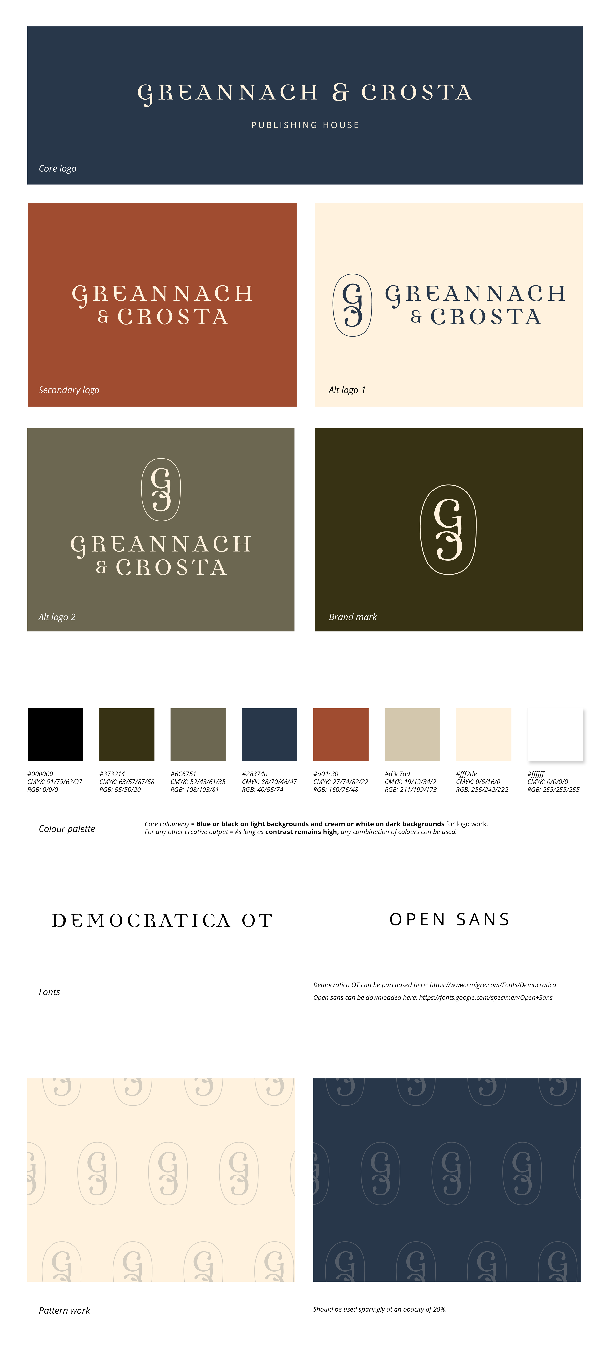
Finally, the identity needed to feel timeless. Rather than referencing contemporary design trends, the visual system draws on the deeper heritage of publishing - traditional typefaces, printer’s marks, archival colour palettes, and tactile print textures - while remaining relevant and functional in a modern context.
Outcome
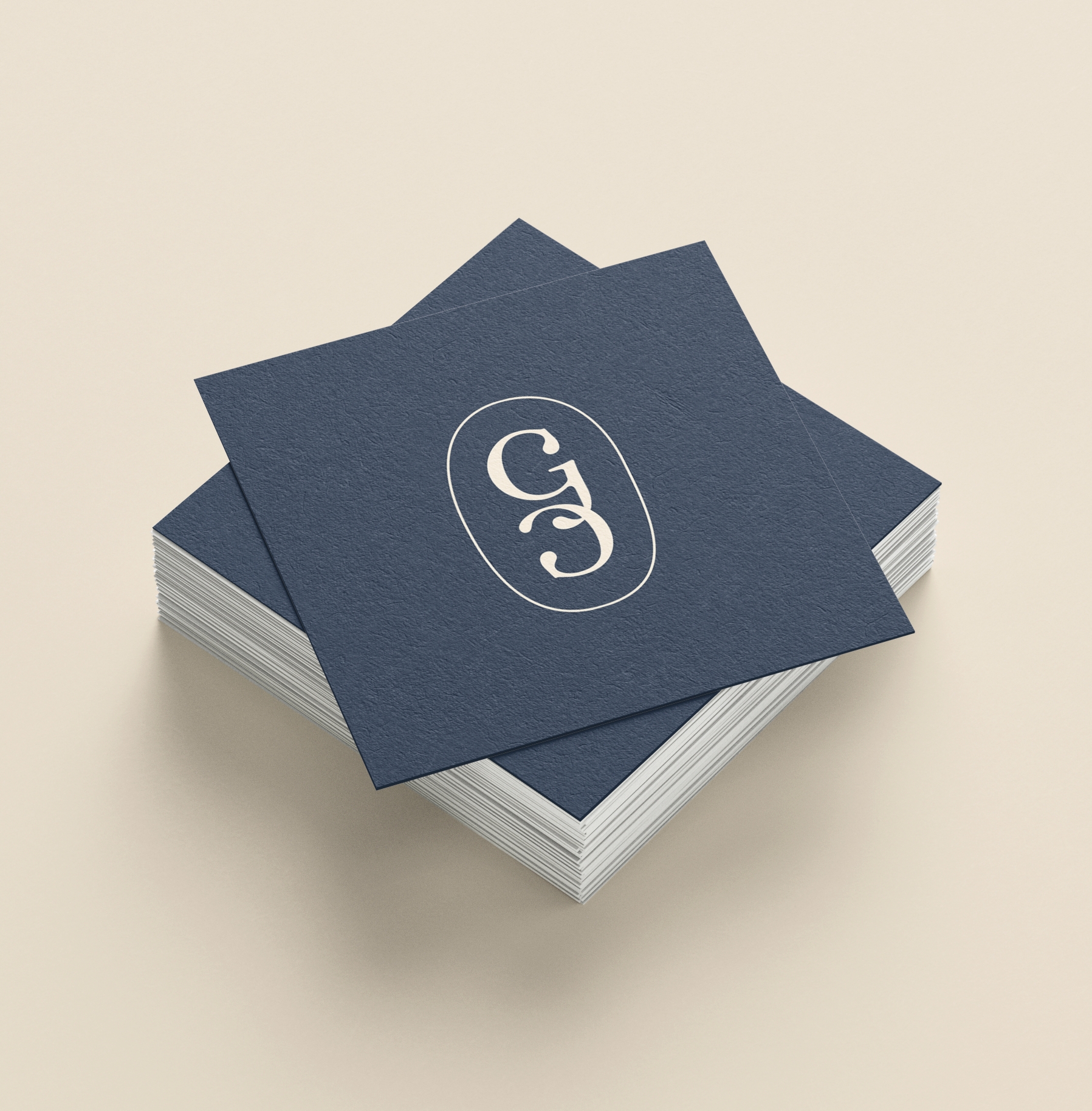
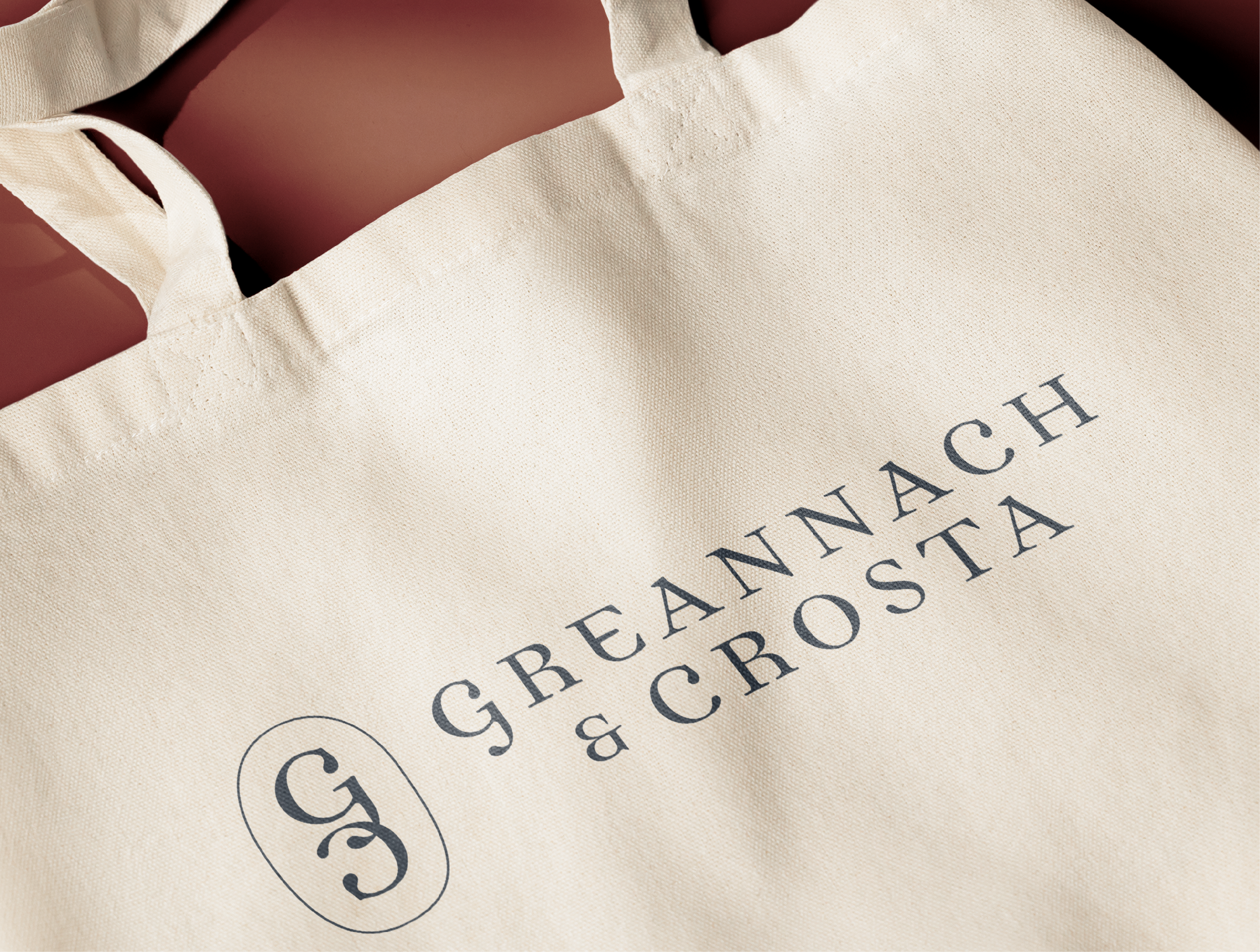
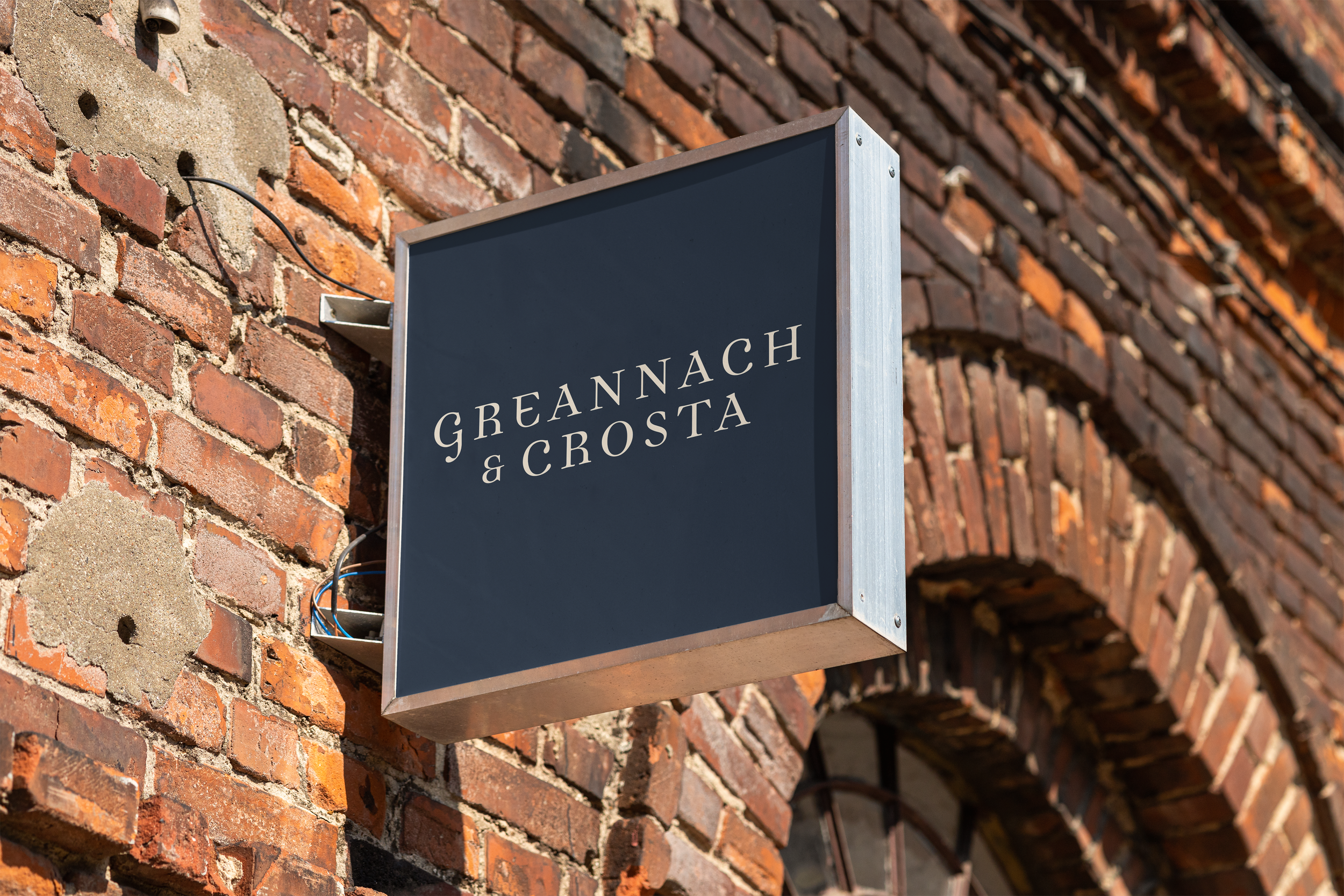
The identity builds on the idea of a traditional publishing house with a human, self-aware character. Rather than following contemporary design trends, the identity draws inspiration from traditional publishing houses and historic bookshop environments.
The concept imagines a bookshop that feels slightly outside of time. Not theatrical nostalgia, but a quiet sense that the space has existed for a long while – a room shaped by books, paper, and conversation. Nothing feels staged or overly curated; instead, the atmosphere suggests care, craft, and longevity. The brand identity reflects this mood through restrained typography, muted colours, and tactile graphic elements rooted in print culture.
Together, these elements create a brand that feels distinctive, thoughtful, and timeless - positioning Greannach & Crosta as publishing house rooted in craft, literature, and accessibility.

We worked with Kelly at Studio K on the full brand identity for our publishing house, Greannach & Crosta, and we couldn’t be happier with the outcome.
From the very beginning, Kelly took the time to properly understand what we were trying to build - not just visually, but philosophically. We had quite a specific tone and positioning in mind, and she translated that into a brand system that feels completely aligned with our vision. The final result embraces exactly what we hoped it would: thoughtful, distinctive, and confident without feeling over-designed.
What stood out most was her ability to balance creativity with clarity. Every decision was backed by rationale, and the process felt structured yet collaborative throughout. On top of that, she’s an absolute pleasure to work with - responsive, patient, and genuinely invested in getting it right.
We’re looking forward to continuing the relationship as we grow, and would wholeheartedly recommend Kelly to anyone looking for intelligent, carefully considered brand work.
Lewis Cole, Director at Greannach & Crosta

Passionate about authentic, bespoke design that adds real value.
Not every business is going to have the same needs, so it is vital that we understand your vision for the future and create a bespoke solution, that is individual to you and the growth of your business. That’s why all of our services are specifically tailored to your individual requirements.
We believe great design goes beyond aesthetics - it should communicate clearly, build trust and support your long-term ambitions. By combining creativity with strategic thinking, we ensure every project is purposeful, considered and designed to make a lasting impact.