Brand design + Web design + Marketing materials
Moringa
Overview
Moringa is a leadership development organisation that helps purpose-driven organisations adopt a person-centred approach to leadership and organisational development. Working across sectors including civil society, education, health, and international development, Moringa supports leaders through coaching, training, and organisational development.
When the project began, Moringa had a logo but no supporting visual identity. The brief was to develop a complete brand system that reflected the organisation’s values of human potential, connection, growth, and positive impact, while creating a professional and consistent presence across all communications.
Challenges
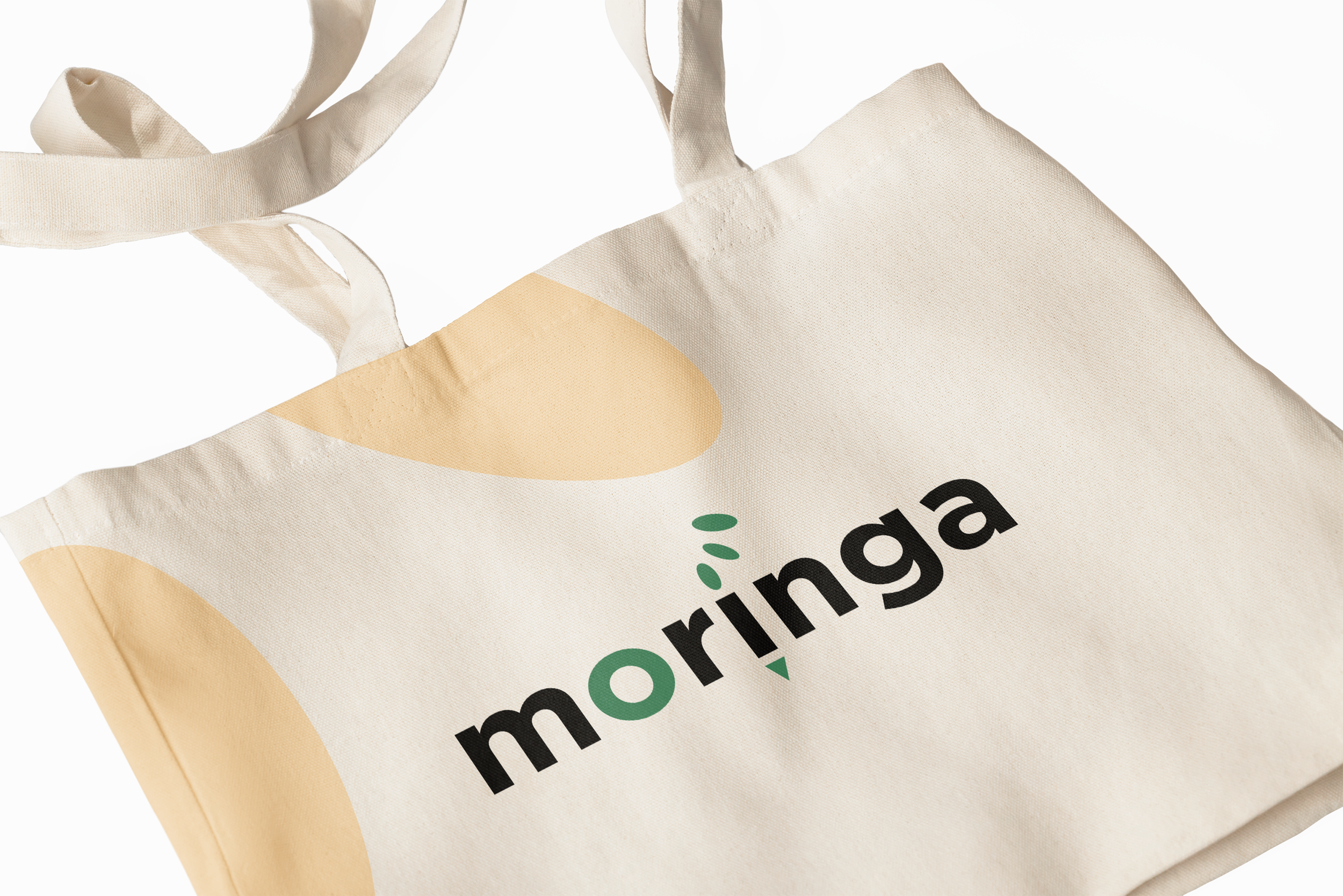
The primary challenge was building a cohesive and flexible brand identity from a single existing asset — the logo. Without an established visual system, there was little guidance on how the brand should appear across different touchpoints.
It was important that the identity balanced professionalism with warmth and humanity, reflecting Moringa’s person-centred leadership philosophy. The brand needed to feel credible and trusted for organisations and institutions, while also communicating empathy, connection, and social impact.
Another key consideration was ensuring the identity worked across multiple contexts - from digital platforms and social media to printed materials and event collateral - while remaining clear, accessible, and visually consistent.
Outcome
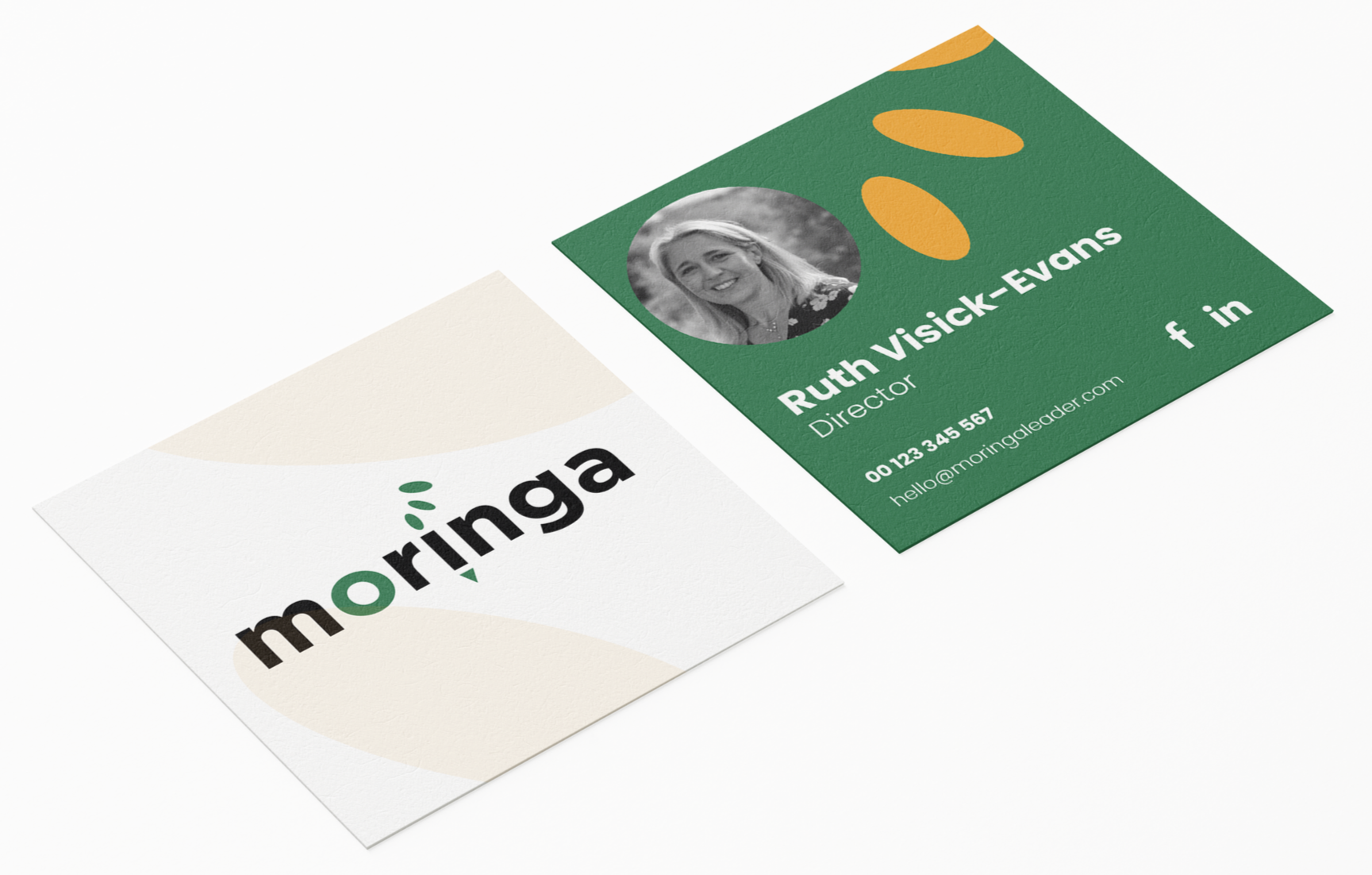
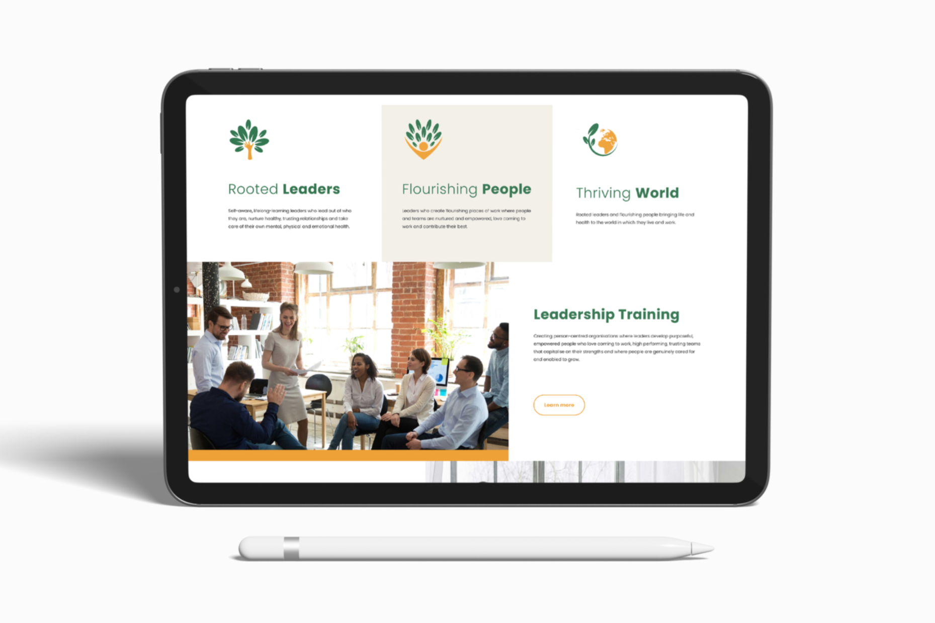
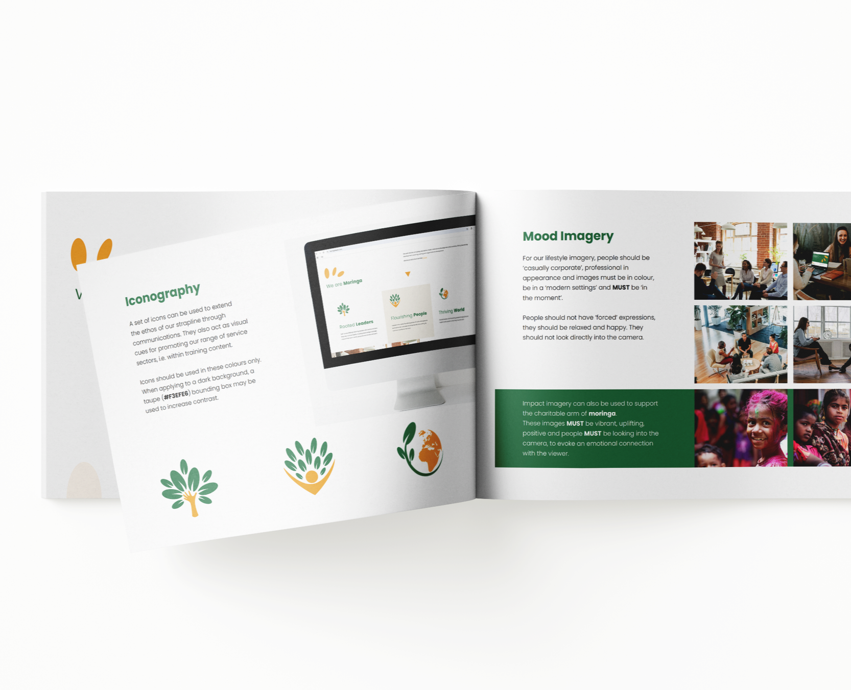
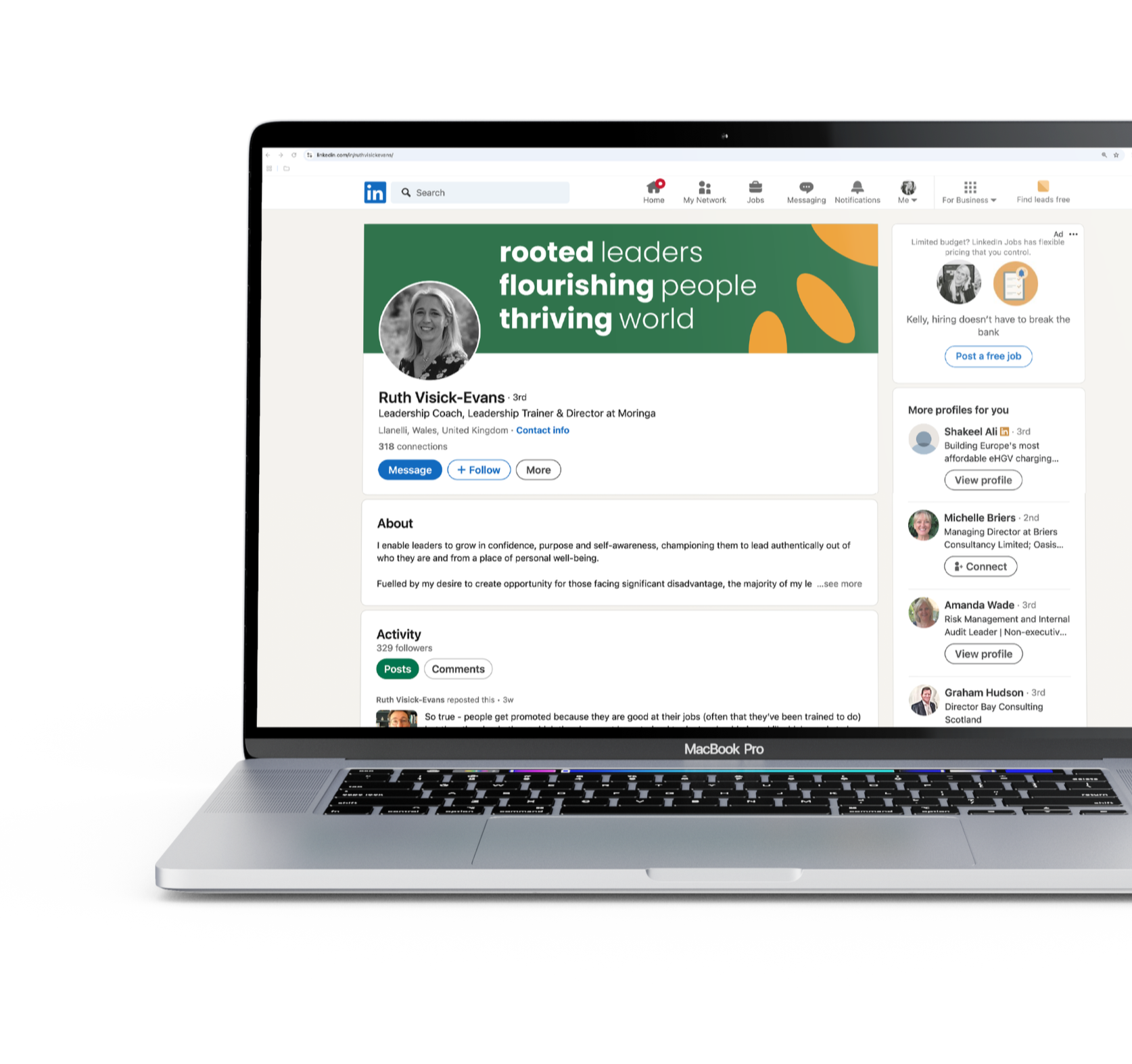
Studio K worked with the team to develop the existing logo into a complete brand identity. This included defining the colour palette, typography, tone of voice, imagery direction, iconography, patterns, and brand applications across both digital and print.
The result was a comprehensive set of brand guidelines, alongside a new website, social media assets, and event materials. The identity features a distinctive colour palette centred around green, supported by complementary tones, a clear typographic hierarchy, and a set of supporting graphic elements including icons and pattern work.
The new identity now supports Moringa’s mission and positioning, giving the organisation a strong, professional visual presence that reflects its values and helps communicate its work with clarity and impact.

“Studio K helped us turn our logo into a full brand identity that finally feels consistent and aligned with our values. The guidelines they created have made it much easier for our team to use the brand confidently across all our communications.”
Ruth Visick-Evans, Director at Moringa

Passionate about authentic, bespoke design that adds real value.
Not every business is going to have the same needs, so it is vital that we understand your vision for the future and create a bespoke solution, that is individual to you and the growth of your business. That’s why all of our services are specifically tailored to your individual requirements.
We believe great design goes beyond aesthetics - it should communicate clearly, build trust and support your long-term ambitions. By combining creativity with strategic thinking, we ensure every project is purposeful, considered and designed to make a lasting impact.